* all images property of Jeff Phegley (www.jeffphegley.com)
Monday, December 22, 2008
Wednesday, December 17, 2008
Monday, December 15, 2008
Vallarta Quemadura
Saturday, November 15, 2008
Brain Burn (thanks for the title Z)
This is a new oil painting (8 x 10 inches). It has been almost two years since I have smelled the linseed oil and I am really enjoying it. This painting is the first of a series that has been living in my head for a long time. I anticipate some large paintings for this series which I am really excited about.
Sunday, November 9, 2008
Burnt
Thursday, November 6, 2008
Saturday, November 1, 2008
Friday, October 31, 2008
Monday, October 20, 2008
Untitled 8.2008
This is a pen and ink drawing. I have just re-discovered the quill pen and how really great it is to work with. I recently have been looking at old master drawings and admiring the artists skills and techniques. Among the chiaroscuro woodcuts and watercolors (which are amazing), crosshatching was used prevalently in both ink and charcoal drawings. I responded to the cross-hatching because that is the technique that I usually apply to my etchings. I felt there was no better and direct way to prepare my etching sketches than with a quill pen and inks. I hope to now do more preparatory sketches with this drawing technique which I hope will help to inform my new etchings.
Friday, October 3, 2008
Break 7.2008
This is a chine colle* etching with drypoint and aquatint. This plate will go through more changes before the final edition is printed. I used the Z-Acryl Hardground Emulsion for the first time on this print. I had a few issues with the hardground splintering when I was scratching lines into the surface. This only happened in a few small areas and I believe it was caused by hardground pooling near the edges. I was otherwise really happy with the results. I am using Ferric Chloride as the etching solution and instead of purchasing an expensive vertical etching tank I am using a plastic sealable cereal box (available at any large grocery store). So far the acid is staying put and not dissolving the plastic.
My goal is to create as small as an environmental footprint as I can in producing etchings. Ferric Chloride in a liquid form is quite safe but when it gets old it needs to be disposed of properly. The bottom of the solution contains the copper that was etched off of the plate which poses an environmental problem when washed into the sink and eventually into the environment. If you use Ferric Chloride please call your local hazardous waste disposal handler to find a drop off location. In Portland, Oregon please contact Metro (http://www.oregonmetro.gov/index.cfm/go/by.web/id=24267).
The aquatint in this print was produced with a spray enamel. I hope to stop using spray enamel and convert to the Z-Acryl Hardground Emulsion. This emulsion can be airbrushed onto the surface of a plate, and according to the website, providing really great results. I hope to try this on my next plate and will publish the results.
*thin Hosho paper was glued to thick Murillo paper during the printing process hence the yellow color of the paper
Wednesday, October 1, 2008
Birdflak 6.2008
Tuesday, September 23, 2008
Crooked 5.2008
Crooked is a two-color print on Hosho paper. This is the first woodblock that I have printed using Daniel Smith water-soluble inks. The inks have a really nice satin finish and do not seem to get glossy when printing over other colors. The downside to the ink is that they take several days to dry (around 4-5 days). Humidity and paper choice will also affect dry times. The upside is that these inks will not reactivate with water once they are dry, and they are a healthy alternative to oil inks.
Sunday, September 14, 2008
Aerial Prowl to be exhibited at NAU Art Museum
Monday, September 8, 2008
Pecking Order 3.2008
This two-color woodcut titled Pecking Order was derived from an old sketchbook drawing. I have been revisiting older sketchbooks, and the ideas and drawings that are floating around within them, to see if they still hold up to my current thoughts and concerns. It has really been rewarding to approach these older ideas and sketches with a new perspective and to finally commit them to a finished work.
Wednesday, August 20, 2008
Geinformeerdo 2.2008
This woodcut is titled Geinformeerdo (Dutch for "enlightened"). The image is derived from a sketch that I made of a man on a train in the Netherlands.
This is a two-color woodcut. The image above illustrates the woodcut process. Image 1: the block is 1/3 cut. Image 2: the block is fully cut except for a few areas which were cut out during the proofing process. Image 3: the block is inked for printing. Image 4: the first color has been printed from block 2 (not shown). Image 5: the final print.
Thursday, August 14, 2008
Crest 1.2008
The challenge has begun.
This woodcut is titled Crest.
This is a three-color woodcut utilizing the paper tone as a fourth color. The lightest ink was printed first and the darkest last. The process is illustrated above.
Labels:
figurative woodcut,
flying machines,
woodcut,
woodcut process
Printmaking Challenge
My art production has been at an all time low this Summer. Maybe it is the heat, maybe I have hit a creative block. It is frustrating. I have been reading up on some of the greats in printmaking, The German Expressionists, which has started a fire in me to produce again.
My goal is to produce at least one print per week for a year. These will include multi-color woodcuts, etchings and monoprints. I hope to exceed the goal and create more than one print per week and if I’m lucky maybe I can sneak a few paintings into the mix as well. Hopefully this site will be updated with new images weekly instead of being considered a “false start”.
Sunday, July 20, 2008
New Drypoint
Mark is a recently completed chine colle drypoint. This print is personally significant because it is the first print pulled on a Dick Blick press that I purchased last year. I have never printed on a portable press before. It was quite challenging getting the pressure where it needed to be and there were more than a few curse words spewed as I made several test prints. I was both relieved and surprised with the outcome, a nice dark impression that exceeded my expectations for a drypoint printed on a small press.
Drypoint prints provide a very immediate result because the image is scratched directly into a plate of copper creating a burr which holds the ink. The downside to a drypoint is that the burr is very delicate and can only yield a few good impressions.
This portrait is based on a good friend who came to my house one day bearing a striking resemblance to Van Gogh. His hair, which is red, was cut short and he was sporting a healthy beard. I was blown away at how much he looked like the master draftsman and felt that this similarity needed to be permanently documented.
Thursday, July 17, 2008
Recycled Plywood Chair
There is a certain amount of waste left over from my projects whether it is wood, paper, metal, etc. I am always bothered by this waste and where it may end up after it is thrown away. I decided to challenge myself to a project of recycling this waste into a functional form.
This chair was constructed from plywood pieces that I would normally would have cut down and thrown into garbage. Most wood scraps are too small and awkward to work into other projects. But if the goal of a project is to utilize that waste to create something unique it instantly takes on a new life and purpose. I really became excited with the idea of building a chair that could be designed from multiple scraps of wood that would be cut to size and joined to create a comfortable functional object.
Plywood has a history of being used as a cheap building material with no real aesthetic value. One of the goals of this project was to make this seemingly ugly wood appear beautiful and somewhat exotic. I decided that this could be accomplished by exploiting the interesting qualities of the plywood's veneered layers. The layers face towards the sitter providing interesting effects from the various colors that are found in the veneer of the plywood. The chair was sanded, stained and polyeurythaned. This was done to further enhance the grains and colors in each of the layers and to provide a surface that encourages the sitter to touch the wood without the worry of getting a splinter, which plywood is usually notorious for.
Thursday, June 19, 2008
Havens
This accordion book titled Havens is composed of multi-colored woodcuts. I chose to use this style of bookbinding in order to create different compositional effects as the viewer walked by the work. The book was composed to allow the viewer to see only the portraits when approaching from the left side and then to see only the flying machines when approaching from the right side. The book can also be experienced from the front so that all of the images can be viewed at once.
Labels:
accordion book,
flying machines,
portraits,
woodblock print,
woodcut
Tuesday, June 17, 2008
Aviator Pioneer
This drypoint etching was completed after reading a historical biography documenting the incredible exploits of an early pioneer in aviation, Alberto Santos-Dumont. The book titled Wings of Madness by Paul Hoffman contains several detailed accounts of Dumont's flying experiences.
This etching includes a portrait of Dumont in his younger days as well as one of his experimental dirigibles named No. 9, Baladeuse which was the world's first personal flying machine.
Thursday, June 5, 2008
Nocturnal Abyss
Saturday, May 31, 2008
Monoprintopia
These monoprints were created a few years ago. I just found them, dusted them off and decided that they deserved their own entry.
Monoprints are really simple to create and can be printed by hand or in an etching press. These monoprints were created by hand. A sheet of plexi-glass was used as the matrix. Etching ink was finger-painted onto the surface of the plexi-glass. Some tools such as toothpicks and q-tips were used to create the finer line work. Once the desired image was achieved a sheet of Rives BFK was soaked in water for 5 minutes. The paper was pulled from the water, blotted and set over the plexi-glass. A bakers rolling pin was rolled over the back of the paper to transfer the image to the paper. Some hand burnishing was also used to achieve the proper transfer contrast. The paper was then lifted to reveal the image.
It is an immediate and very spontaneous way to create quick imagery with great tonal range.
Saturday, February 23, 2008
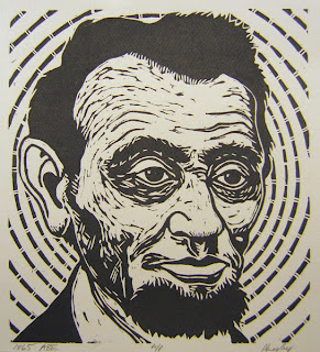
Lincoln Obsession
I have been fascinated with vintage images of Abraham Lincoln for the last several months and the end product of this energy is the creation of Lincoln portraits in various stages of his life. There are very few photos of Lincoln that survive and most of them are close-ups of his face. The treatment of Lincoln in the following images are very different from one another. I produced these images several months apart as my medium choices changed between the production of each image.
The photographs of Lincoln taken during various points in his political career are quite interesting. His facial features provide a barometer for the times in which he was living. I tried to retain those emotions in the portraits below.
Head with Wings is based on a Calvin Jackson Ambrotype taken of Lincoln on October 1, 1858 (two years before he won the Presidency). Lincoln, pre-beard, appears untested, reserved yet focused.
Cohiba Lincoln is based on a Alexander Gardner Silver Gelatin Print taken of Lincoln on November 8, 1863 (mid-way through the Civil War). Lincoln's face is showing wear from the war. The war-tested President faces the viewer in a confrontational composition.
1865 Abe is based on an Alexander Gardner Silver Gelatin Print taken of Lincoln on February 5, 1865 (four days before the assassination of Lincoln). Lincoln's face seems to have aged several years per year of the war yet in this photograph he seems at ease and is smiling slightly.
Labels:
Abraham Lincoln,
aviation,
cigar box,
Civil War,
woodcut
Monday, February 18, 2008
Commission Completed!
The work below, entitled Winston, is based on a 1940 photograph taken of Winston Churchill shortly after test firing a Tommy gun. The well-dressed politician, gingerly holding a weapon favored by gangsters and soldiers alike, instantly grabbed my attention; I felt that the weighty, paradoxical image would lend itself to a large-scale portrait.
When I am approached to do a commission I am generally hesitant, as they are usually of a subject matter that is personal to the client instead of the artist. When I was given the small, black-and-white reproduction photograph of this historical icon I was instantly intrigued. I have always been interested in the life of Winston Churchill, and this project would give me the opportunity to learn more about this pivotal man who was also a prolific painter.
The painting presented a great challenge, since dealing with such a well-known face is intimidating when trying to capture the likeness of the individual. When I work with portraits, I generally prefer to change the features of the face so that there is not an exact replica to the original, be it from photograph or from life. This project was made even more challenging by the grainy, out-of-focus image from which I was working. Because of the poor quality likeness, I researched other photographs of Churchill from different times in his life to create a composite portrait reflecting his image from the early 1940s.
“Happy are the painters, for they shall not be lonely. Light, color, peace and hope will keep them company to the end, or almost to the end, of the day.” (Winston Churchill)
Portrait based upon the Horton photograph of Winston Churchill, collection of the Imperial War Museum, London.
Monday, February 11, 2008
Hooligans
New images uploaded!
The Hooligan Series is a series of 10 etchings which were executed in 2006. These prints were inspired by the book Among the Thugs by American journalist Bill Buford. Buford's autobiographical book is his graphic account of embedding himself in the frantic and violent world of England's football supporter societies. Buford's vivid descriptions of the football fans and their involvement in organized pre- and post-game violence inspired me to capture what I thought some of these veteran "firm" supporters might look like. Enjoy.
Thursday, January 24, 2008
Painting on view at Coos Art Museum
My painting entitled Bastogne is currently on display in the Bay Area Artists Association Regional Juried Exhibition. The show will be on view at the Coos Art Museum through February 16, 2008. The work can also be viewed online at:
Coos Art Museum
Bastogne was completed in 2007 and incorporates an old Pepsi crate as the frame for the work. The oil painting is composed on 11 raised panels within the Pepsi crate. The painting was inspired by the Siege of Bastogne, a significant World War II battle which took place in the city of Bastogne, located in the Southeast corner of Belgium. The battle was an important Allied success amidst the larger Battle of the Bulge, in which the Allies were victorious in holding off the western advancing German Army. I was fortunate enough to visit the battlefields and memorial in early 2007 and was very shocked to learn of the severe cold conditions in which the Americans and the Germans had to fight. This work is about a veteran (Allied or German) returning to the site of the battlefield and reflecting on those events.
The Bastogne Mardasson Memorial is an impressive site which was dedicated to the US by the Belgian citizens in 1950. The memorial can be seen from several miles away as it situated on a grassy hill surrounded by lower lying pastures. Approaching the stone memorial, 250 feet in diameter and 40 feet in height, you feel as if you are at the National Mall in Washington DC. A large structure devoted to US servicemen seems completely out of place overlooking the small Belgian city of Bastogne. Once you grasp the significance of the Siege (both in the loss of human life and in what was at stake militarily) it is easy to experience a swell of emotion and realize how incredibly different the world would be if the German Army had succeeded here. At the top of the memorial you are graced with an amazing panoramic view of the peaceful countryside of Bastogne. Flat bronze markers on the top of the monument contain battle descriptions in relief as well as arrows pointing towards the various battlefields within sight of the memorial.
Subscribe to:
Posts (Atom)